Houdini + Co.
Since 2004 Houdini has grown from two persons in a basement to be represented in over 200 stores globally, we believe the strong brand design developed by Co. has something to do with it.
The Houdini brand was designed to be clean, functional and resilient – just as the products themselves. From the beginning it was clear communication had to be functional and efficient due to budget restraints.
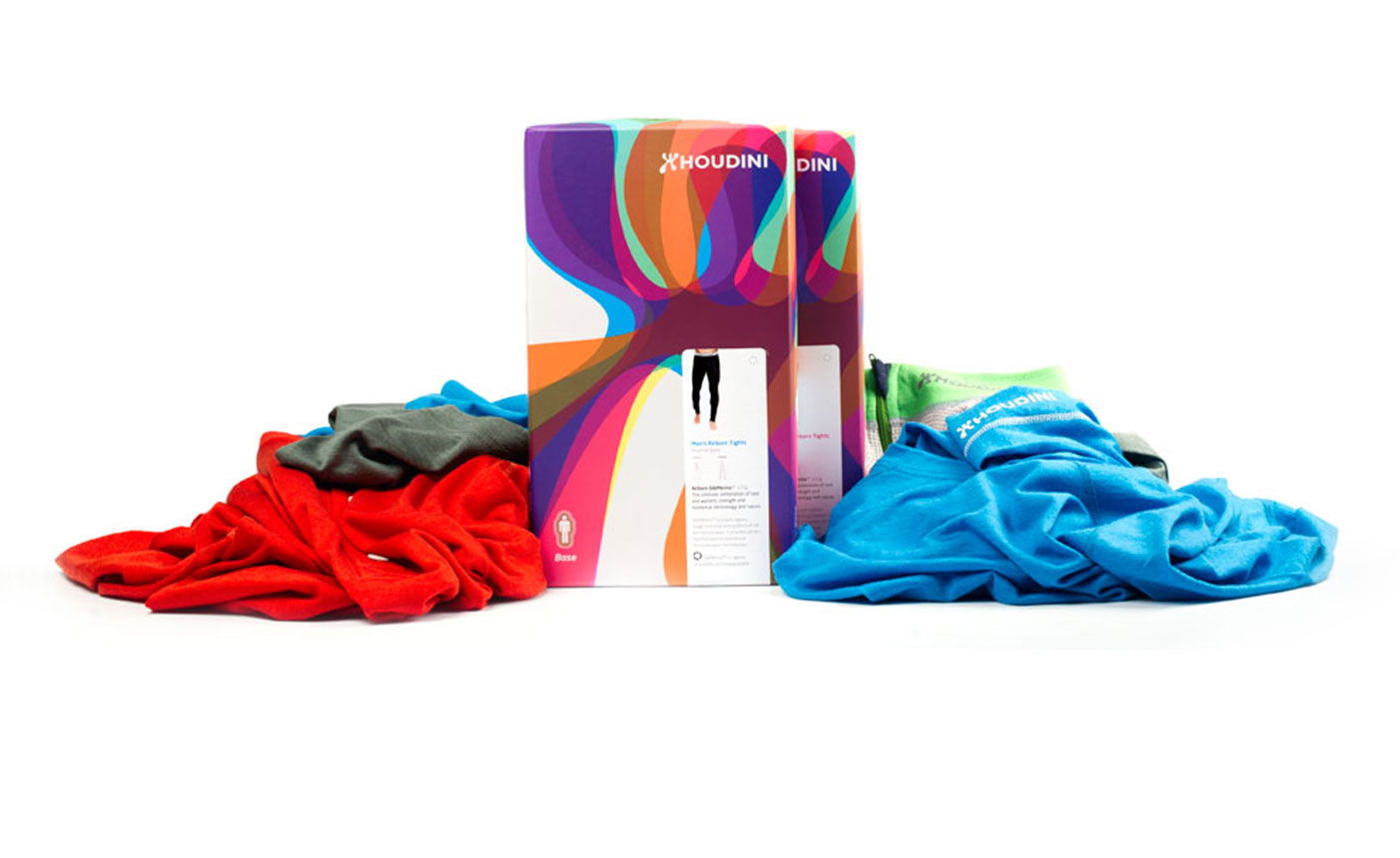
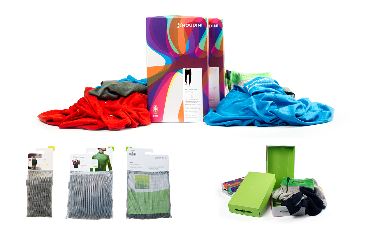
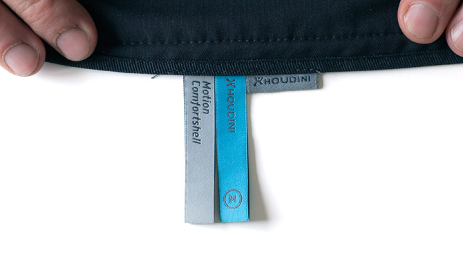
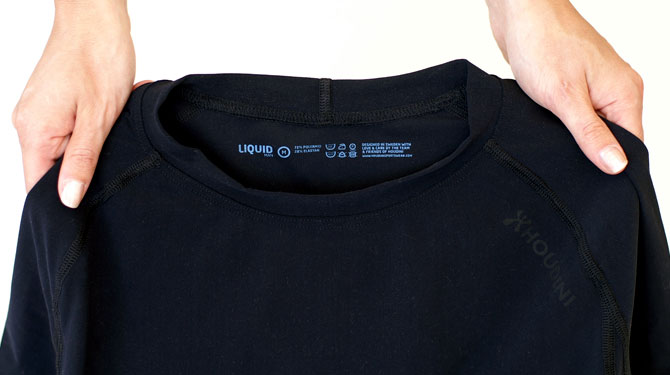
A multifunctional approach was essential; the workbook is produced to also function as a fold out signage in stores. Care labels printed on clothes contain boosting messages for the carrier to remember Houdini by.
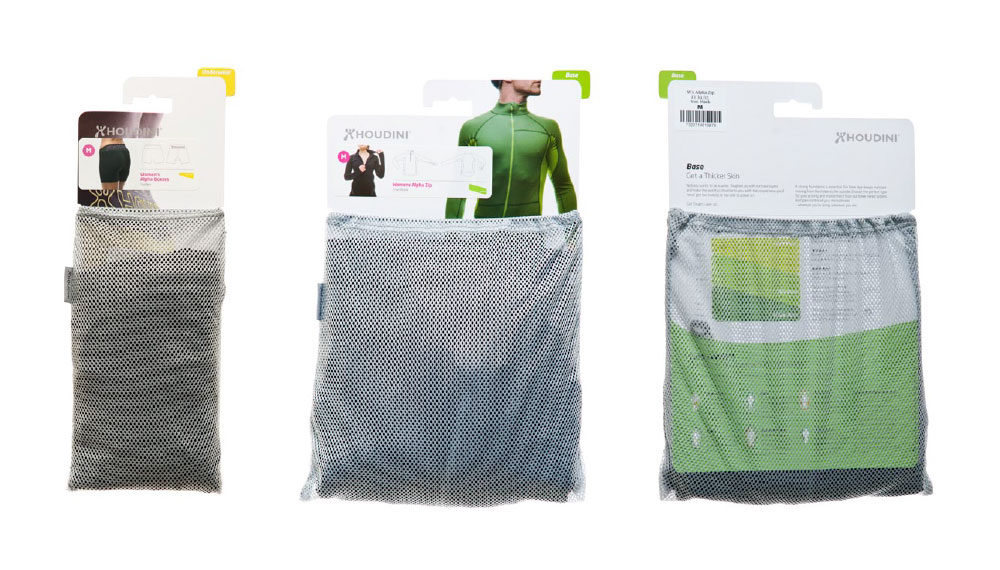
Another multifunctional example is the product package which may be folded inside out to function as a gift package or storage container in the recipients home.
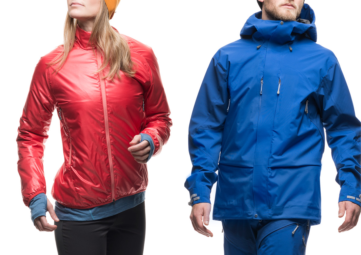
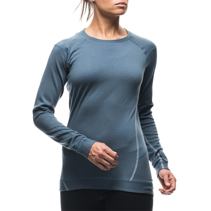
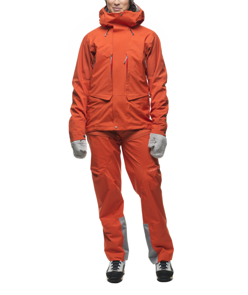
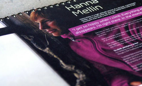
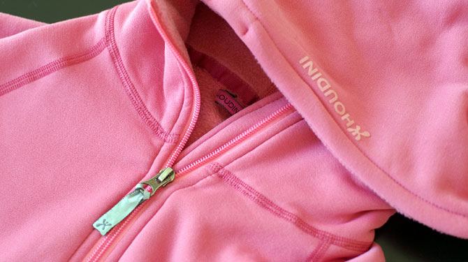
As product images are key brand assets and carriers of identity, we created a fresh new photographic style, enabling us to work with friends and Houdini employees rather than experienced models.
The style mimic movements present in sports, dance and life – rendering in an eye-catching look.
From a resource perspective packaging is often devised with a prolonged life as it is designed to be used again, for instance as a wash bag for bras.
Houdini continue to grow globally, and we are excited to see where we end up.
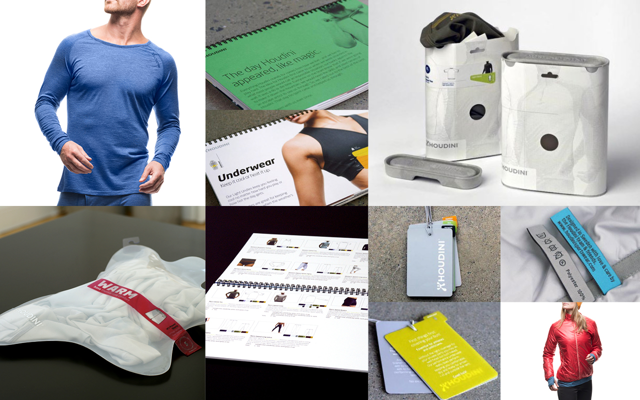
The clean, almost simplistic, graphic language makes it easy to produce communication material by the Houdini staff themselves. All templates and advertising material is handed over to the in house team for reproduction.
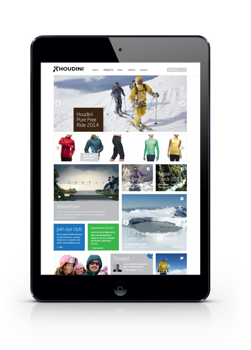
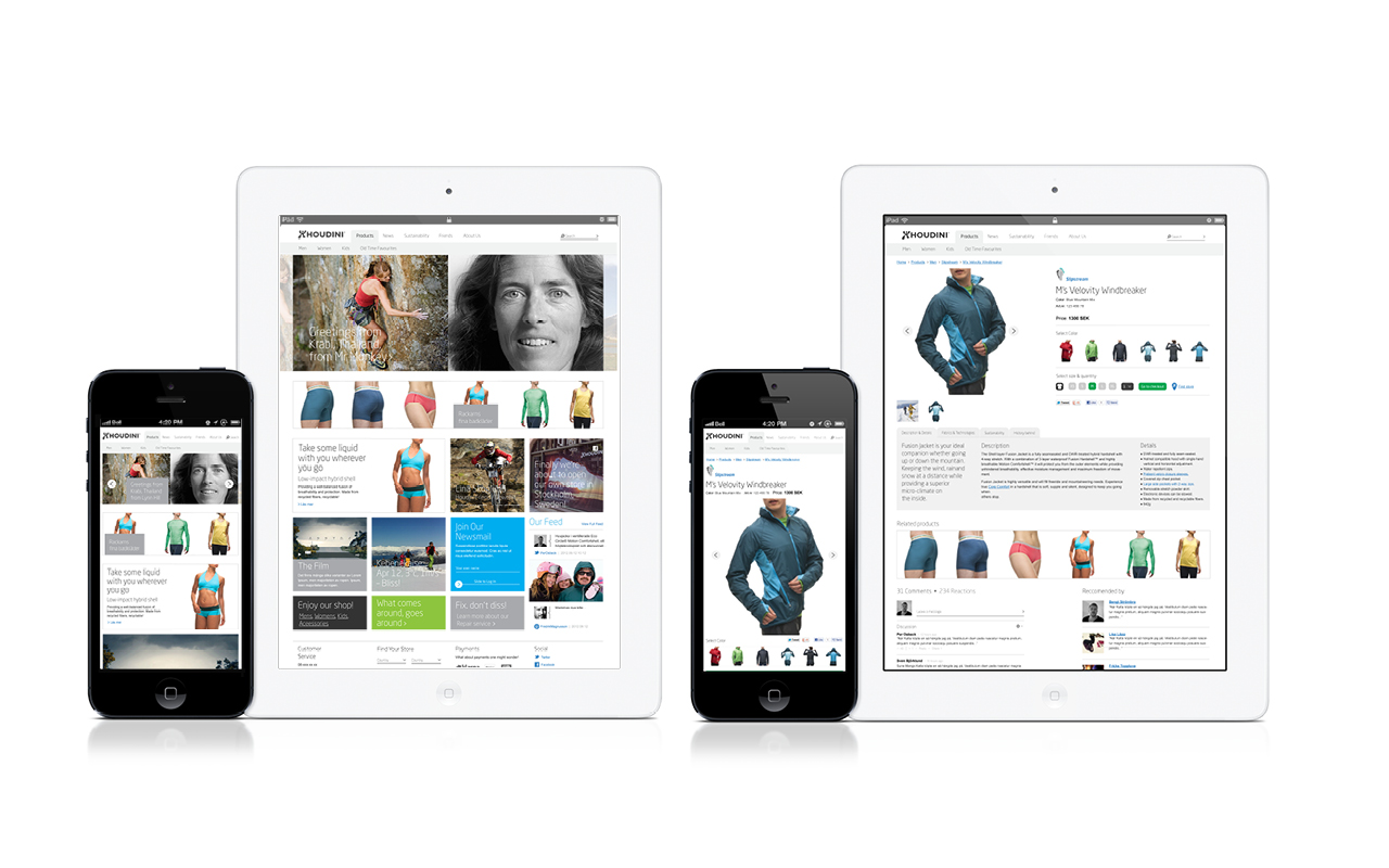
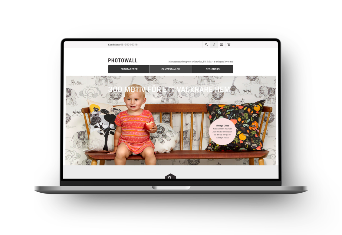
The site is filled with products, news, media and promotions. The site lets Houdini convey their brand values cross the globe.